Tools menu
The Tools menu includes, among other functionalities, tools that are helpful for the graphical analysis of a time series. The ‘X-13ARIMA-SEATS Reference Manual’ (2015) strongly recommends studying a high resolution plot of the time series as it is helpful to gain insight on issues, such as, seasonal patterns, potential outliers and stochastic non-stationarity. Also the ‘ESS Guidelines on Seasonal Adjustment’ (2015) recommends carrying out a graphical analysis on both unadjusted data and the initial run of the seasonal adjustment. Graphical analysis should consider:
- The length of the series and the model span;
- The presence of zeros, outliers or problems in the data;
- The structure of the series: presence of; long term and cyclical movements, seasonal components, volatility etc.;
- The presence of possible breaks in the seasonal behaviour;
- The decomposition scheme (additive, multiplicative).
The ‘ESS Guidelines on Seasonal Adjustment’ (2015), recommend that this exercise should be performed and documented for the most important series to be adjusted at least once a year. The following functionalities are available from the Tools menu:
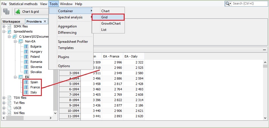
- Container – includes several tools for displaying data in a time domain;
- Spectral analysis – contains tools for the analysis of a time series in a frequency domain;
- Aggregation – enables the user to investigate a graph of the sum of multiple time series;
- Differencing – allows for the inspection of the first regular differences of the time series;
- Spreadsheet profiler – offers an Excel-type view of the XLS file imported to JDemetra+.
- Plugins – allows for the installation and activation of plugins, which extend JDemetra+ functionalities.
- Options – presents the default interface settings and allows for their modification.
The Tools menu
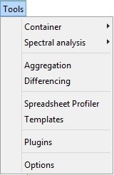
Container
Container includes basic tools to display the data. The following items are available: Chart, Grid, Growth Chart and List.
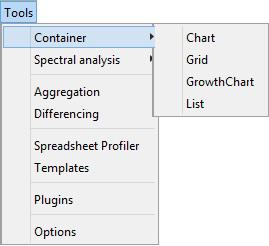
The Container menu
Several containers can be opened at the same time. Each of them may include multiple time series.
Chart plots the time series as a graph. This function opens an empty window. To display a given series drag and drop the series from the Providers window into the empty window. More than one series can be displayed on one graph. The chart is automatically rescaled after adding a new series.
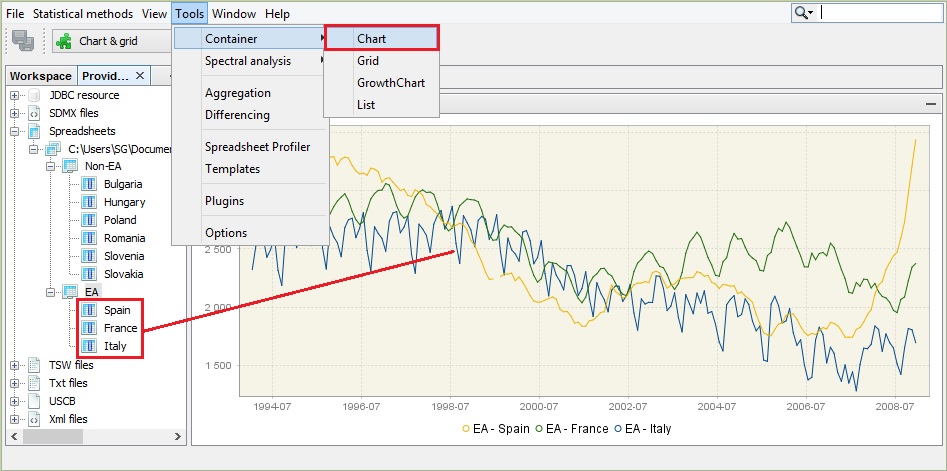
Launching the Chart functionality
The series to be viewed can be also dragged from the other windows (e.g. from the Variables window) or directly from the windows that display the results of the estimation procedure.
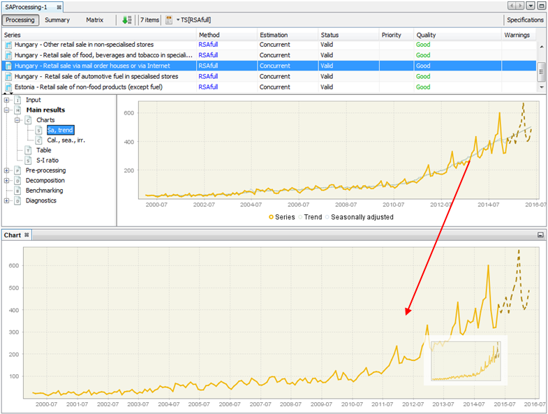
Displaying the seasonally adjusted series on a separate chart
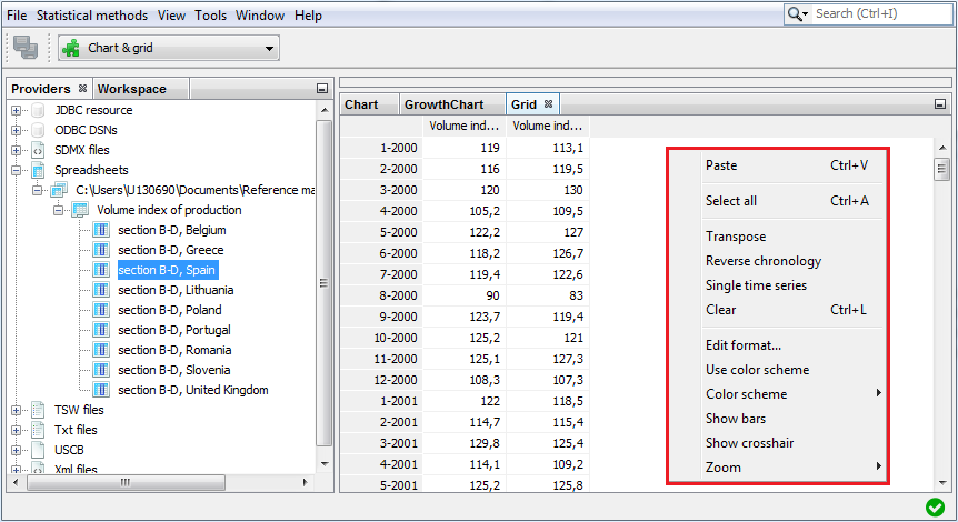
To adjust the view of the chart and save it to a given location use the local menu, which is displayed after right-clicking on the chart. The explanation of the functions available for the local menu is given below.
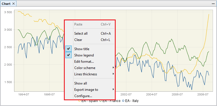
Local menu basic options for the time series graph
To display the time series value at a given date, hover over it with the cursor. Once the time series is selected by clicking on it with the right mouse button, the options dedicated to this series are available.
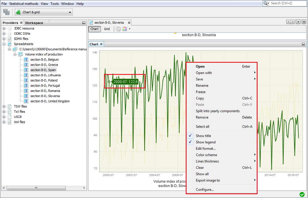
Local menu options for chart
A list of possible actions includes:
-
Open – opens selected time series in a new window that contains Chart and Grid panels.
-
Open with – opens the time series in a separate window according to the user choice (Chart & grid or Simple chart). The All ts views option is not currently available.
-
Save – saves the marked series in a spreadsheet file or in a text file.
-
Rename – enables the user to change the time series name.
-
Freeze – disables modifications of the chart.
-
Copy – copies the series and allows it to be pasted to another application e.g. into Excel.
-
Paste – pastes the time series previously marked.
-
Split into yearly components – opens a window that presents the analysed series data split by year. This chart is useful to investigate the differences in time series values caused by the seasonal factors as it gives some information on the existence and size of the deterministic and stochastic seasonality in data.
-
Remove – removes a time series from the chart.
-
Select all – selects all the time series presented in the graph.
-
Show title – option is not currently available.
-
Show legend – displays the names of all the time series presented on the graph.
-
Edit format – enables the user to change the data format.
-
Color scheme – allows the colour scheme used in the graph to be changed.
-
Lines thickness – allows the user to choose between thin and thick lines to be used for a graph.
-
Clear – removes all the time series from the chart.
-
Show all – this option is not currently available.
-
Export image to – allows the graph to be sent to the printer and saved in the clipboard or as a file in a jpg format.
-
Configure – enables the user to customize the chart and series display.
Grid enables the user to display the selected time series as a table. This function opens an empty window. To display a given series drag and drop the series from the Providers window into the empty window. More than one series can be displayed in one table.
Launching the Grid functionality
To display options available for a given time series, left click on any time series’ observation.
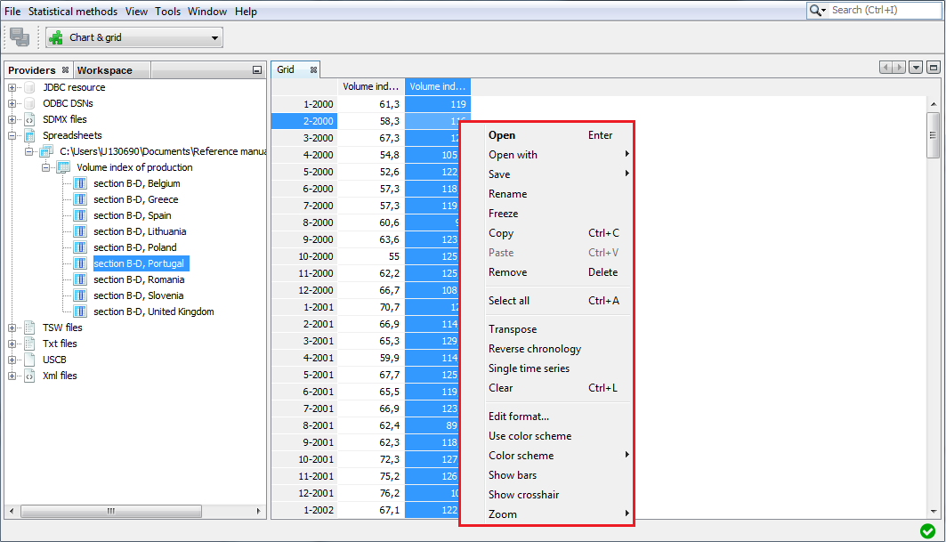
Local menu options for the Grid view
The options available in Grid are:
-
Transpose – changes the orientation of the table from horizontal to vertical.
-
Reverse chronology – displays the series from the last to the first observation.
-
Single time series – removes from the table all time series apart from the selected one.
-
Use color scheme – allows the series to be displayed in colour.
-
Show bars – presents values in a table as horizontal bars.
-
Show crosshair – highlights an active cell.
-
Zoom – option for modifying the chart size.
When none of the series is selected, the local menu offers a reduced list of options. The explanation of the other options can be found below in the ‘Local menu options for chart’ figure in the Container section.
A reduced list of options for Grid
The Growth chart tab opens an empty window. Once a given series is dropped into it, Growth chart presents the year-over-year or period-over-period growth rates for the selected time series. More than one series can be displayed in a table. The growth chart is automatically rescaled after adding a new series.
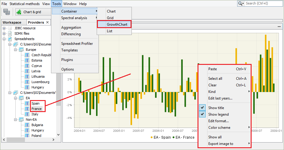
The Growth chart view with a local menu
A left click displays a local menu with the available options. Those that are characteristic for the Growth chart are:
-
Kind – displays m/m (or q/q) and y/y growth rates for all time series in the chart (previous period and previous year options respectively). By default, the period-over-period growth rates are shown.
-
Edit last year – for clarity and readability purposes, only five of the last years of observations are shown by default. This setting can be adjusted in the Options section, if required.
The explanation of other options can be found below in the ‘Local menu options for chart’ figure in the Container section.
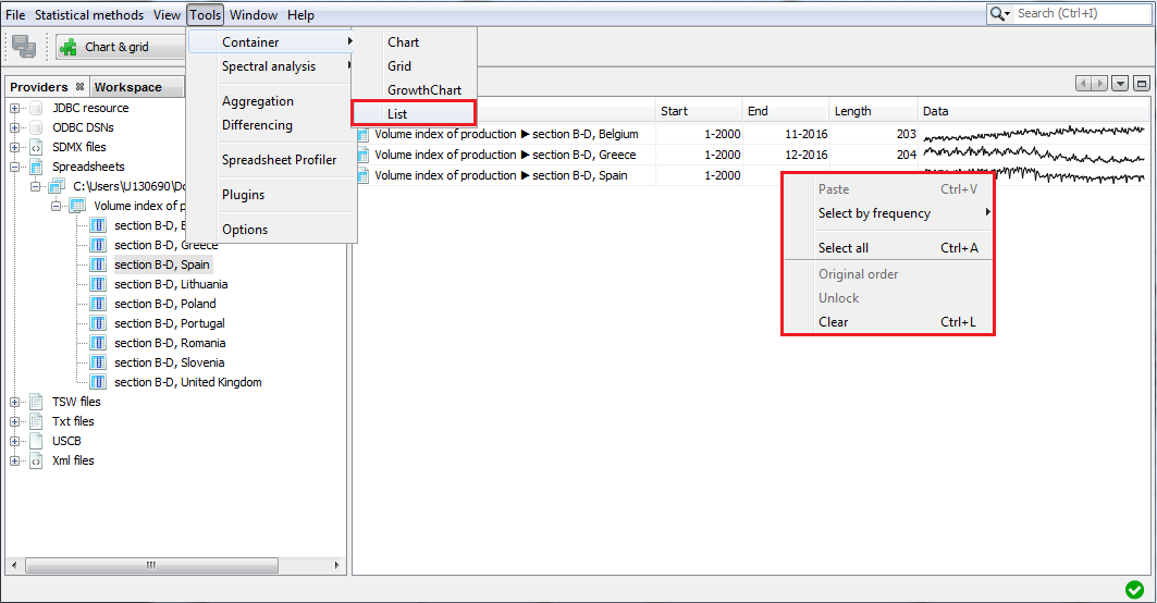
The List tab provides basic information about the chosen time series, such as; the start and end date, the number of observations and a sketch of the data graph. This function opens an empty window. To display information, drag and drop the series from the Providers window into the List window. A right click displays the local menu with all available options. Apart from the standard options, the local menu for List enables marking the series that match the selected frequency (yearly, half-yearly, quarterly, monthly) by using the Select by frequency option. An explanation of other options can be found below in the ‘Local menu options for chart’ figure in the Container section.
A view of a list of series
For a selected series a local menu offers an extended list of options. The explanation of the functions available for the local menu is given below in the ‘Local menu options for chart’ figure in the Container section.
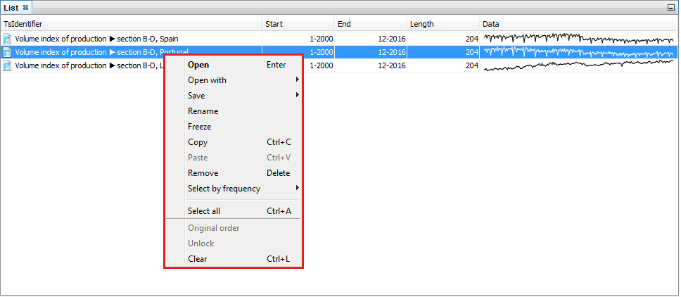
Options available for a selected series from the list
Spectral analysis
The Spectral analysis section provides three spectral graphs that allows an in-depth analysis of a time series in the frequency domain. These graphs are the Auto-regressive Spectrum, the Periodogram and the Tukey Spectrum. For more information the user may study a basic desription of spectral analysis and a detailed presentation of the abovementioned tools.
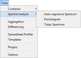
Tools for spectral analysis
Aggregation
Aggregation calculates the sum of the selected series and provides basic information about the selected time series, including the start and end date, the number of observations and a sketch of the data graph, in the same way as in the List functionality. Aggregation opens an empty window. To sum the selected series, drag and drop them from the Providers window into the Aggregation window. Right click displays the local menu with the available options. The content of the local menu depends on the panel chosen (the panel on the left that contains the list of the series and the panel on the right that presents the graph of an aggregate). The local menu for the list of series offers the option Select by frequency, which marks all the series on the list that are yearly, half-yearly, quarterly or monthly (depending on the user’s choice). The explanation of the other options can be found below in the ‘Local menu options for chart’ figure in the Container section. The local menu for the panel on the left offers functionalities that are analogous to the ones that are available for the List functionalities, while the options available for the local menu in the panel on the left are the same as the ones available in Chart (see Container).
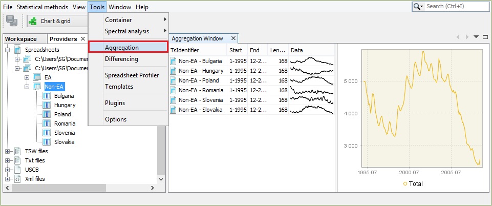
The Aggregation tool
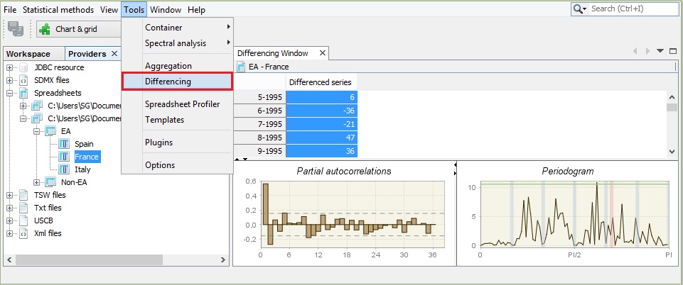
Differencing
The Differencing window displays the first regular differences for the selected time series together with the corresponding periodogram and the PACF function. By default, the window presents the results for non-seasonally and seasonally differenced series \(\left( d = 1,D = 1 \right)\). These settings can be changed through the Properties window (Tools → Properties). A description of a periodogram and the PACF function can be found here.
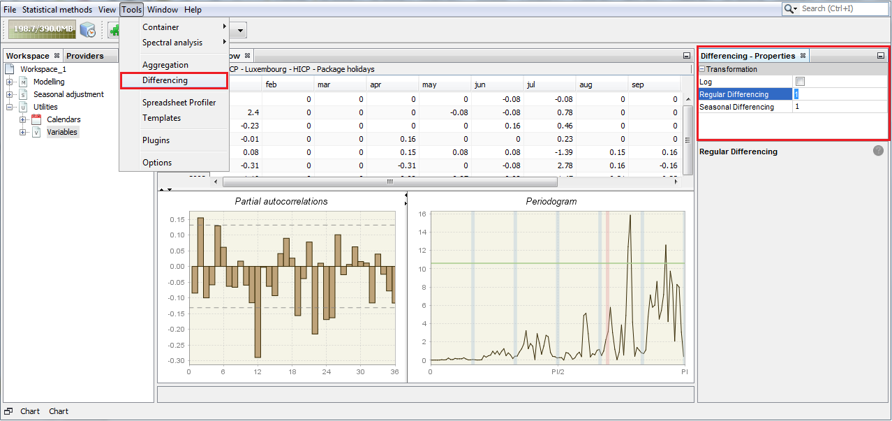
The properties of the Differencing tool
The typical results are shown below. The bottom left graph presents the partial autocorrelation coefficients (vertical bars) and the confidence intervals. The right-click local menu offers several functionalities for a differenced series. An explanation of the available options can be found below in the “Local menu options for chart” figure in the Container section.
The Differencing tool
For the Partial autocorrelation and the Periodogram panels the right-button menu offers “a copy series” option that allows data to be exported to another application and a graph to be printed and saved to a clipboard or as a jpg file. Information about the partial autocorrelation function is given here. The description of a periodogram is presented in the Spectral graphs scenario.
Spreadsheet profiler
The Spreadsheet profiler offers an Excel-type view of the XLS file imported to JDemetra+. To use this functionality drag the file name from the Providers window and drop it to the empty Spreadsheet profiler window.
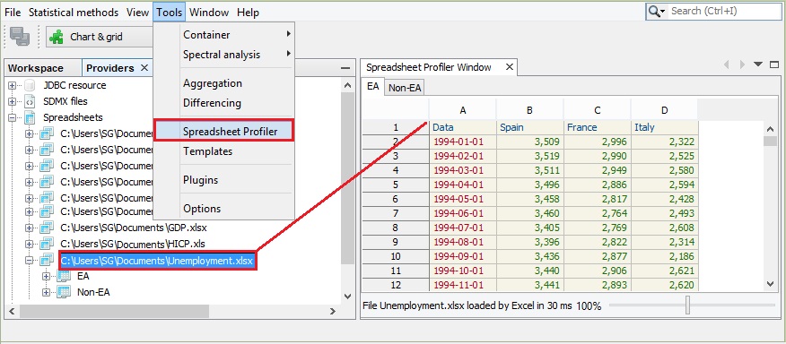
The Spreadsheet Profiler window
Plugins
JDemetra+ is an application that supports plug-ins. A plugin is a software component that adds a specific feature to the existing software application and is independent from the software version. It allows an application to be enhanced without changing the original code. Plugins can be shared between the users and installed individually. In this way new functionalities can be easily distributed among seasonal adjustment community members.
The Plugins window includes five panels: Updates, Available plugins, Downloaded, Installed and Settings, some of them however are not operational in the current version of the software.
- The Updates panel offers the user the option to manually check if some updates of the already installed plugins are available. This functionality, however, is currently not operational for the JDemetra+ plugins.
- The Available plugins panel allows the downloading of all plugins that are related to JDemetra+. This functionality, however, is currently not operational for the JDemetra+ plugins.
- The Downloaded panel is designed for the installation of new plugins from a local machine. This process in explained in more detail below.
- The Settings panel is designated for adding update centres, which are the locations that hold plugins. For each centre the user can specify proxy settings and a time interval to automatically check for any updates. At the moment this functionality is not operational for the JDemetra+ plugins.
Installation of the new plugins from the local machine can be done from the Plugin functionality activated from the Tools menu.
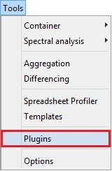
Activation of the Plugin functionality from the Tools menu
To start the process, go to the Downloaded panel and click on the Add Plugins… option. Next the user should select the plugins from the folder in which the plugins have been saved and click the OK button.
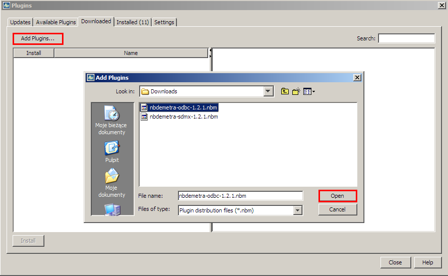
The Downloaded panel – the choice of available plugins
The new plugin is now visible in the panel.
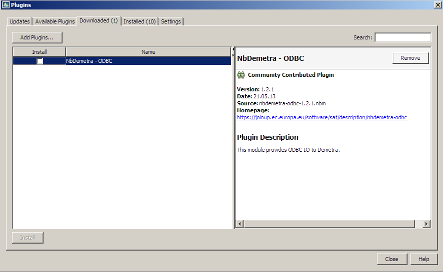
A downloaded plugin
Click on it and choose the Install button.
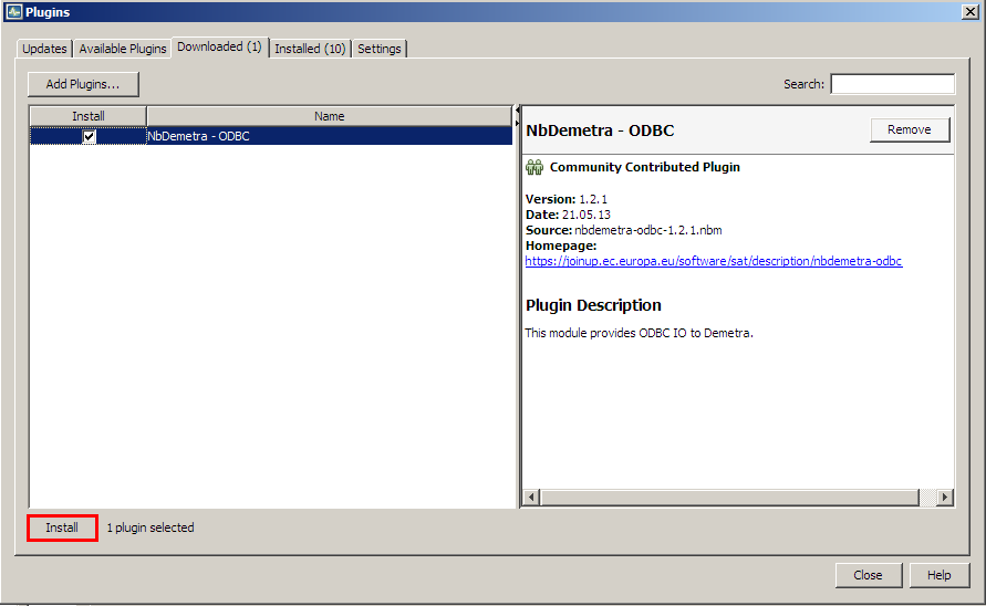
Starting an installation procedure
There is a wizard that allows the user to install the marked plugin(s). In the first step choose Next to continue or Cancel to terminate the process.
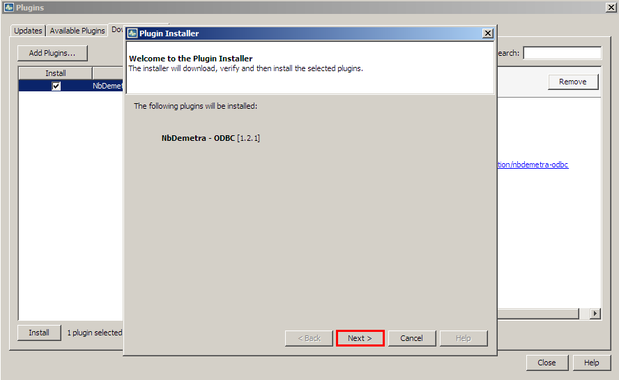
Installation wizard window
Next, mark the terms of agreements and choose Install.
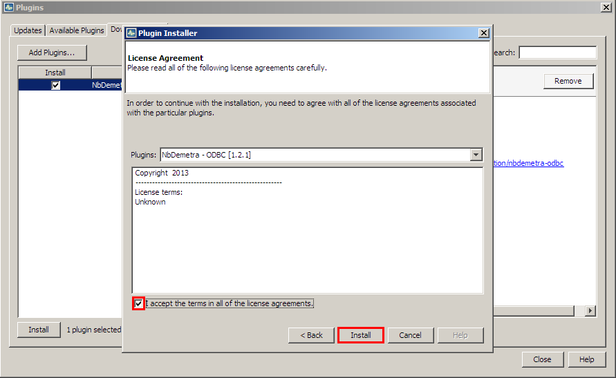
Initiating installation process
Then the process is started.
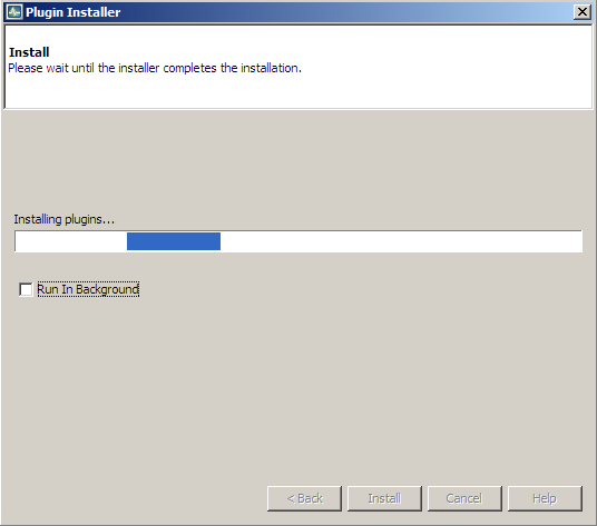
Installation in progress
After a while JDemetra+ will provide an update in the installation process. Click Finish to close the window.
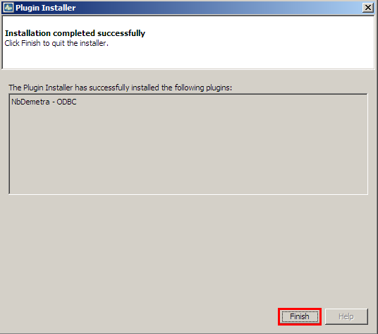
Installation completed
Once the process is finished, the newly installed plugin is automatically integrated within the software. The picture below compares the view of the Workspace window before (on the left) and after (on the right) the installation of the NbDemetra-ODBC plugin.
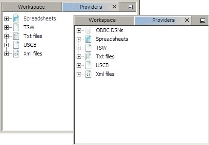
The impact of the plugin on the interface
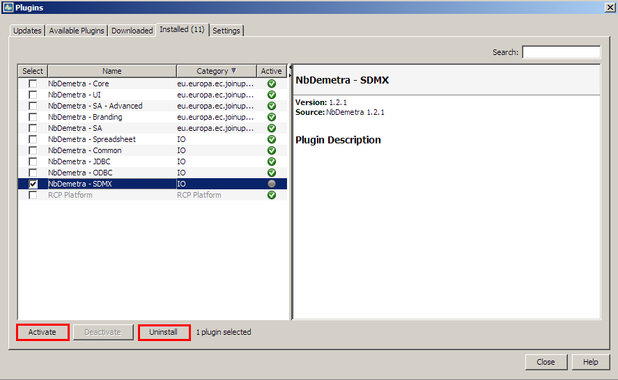
The list of all installed plugins is displayed in the fourth panel. To modify the current settings mark the plugin (by clicking the checkbox in the Select column) and chose an action.
The following options are available:
-
Activate – activates the marked plugin if it is currently inactive. The option is available for inactive plugins (see the picture below);
-
Deactivate – deactivates the marked plugin if it is currently active. The option is available for active plugins (see the picture below);
-
Uninstall – uninstalls the marked plugin.
Inactive plugins can be activated or uninstalled.
Active plugins can be deactivated or uninstalled
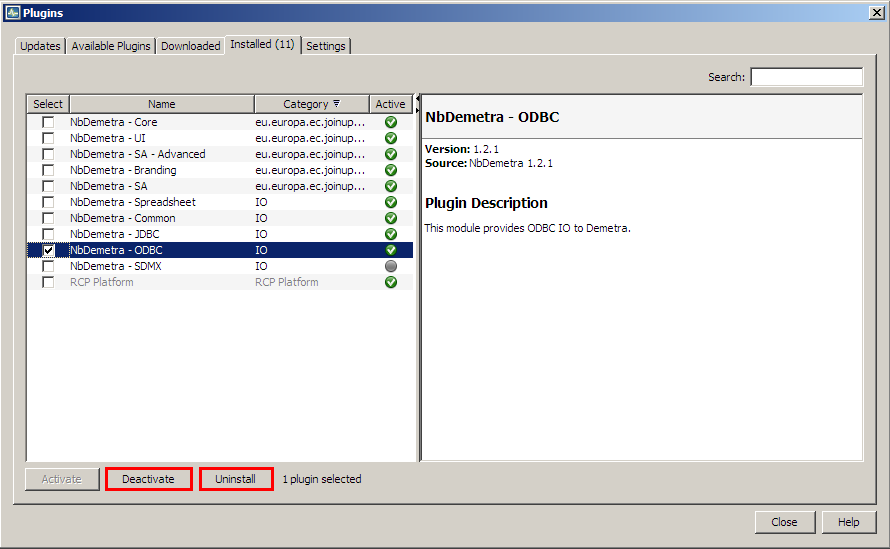
List of plugins – deactivation
There is a wizard that allows the user to activate/deactivate/uninstall the marked plugin(s). The example below illustrates the deactivation process. In the first step the user is expected to confirm or cancel the deactivation.
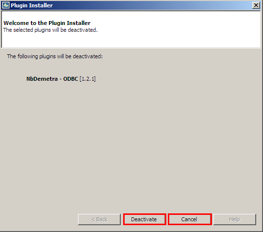
Plugin’s deactivation process
In the second step the user should decide if the software will be restarted immediately after the uninstallation is completed or not.
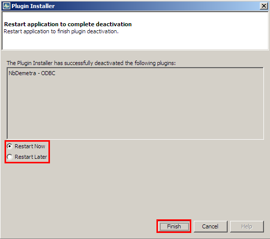
The final step of the installation procedure
It is possible to delay the restart of the application, although the restart is necessary to complete the process.
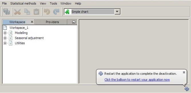
Information concerning the restarting of JDemetra+
NETBEANS plugins embedded within JDemetra+
By default, the JDemetra+ includes the plugins listed in the table below
Default JDemetra+ plugins.
| Name | Category | Description |
|---|---|---|
| NbDemetra – Anomaly detection | SA core algorithms | Identification of outliers |
| NbDemetra – Spreadsheet | IO (Input/output) | Time series providers for spreadsheet (Excel, OpenOffice) |
| NbDemetra – Common | IO (Input/output) | Common time series providers, like XML and TXT |
| NbDemetra – JDBC | IO (Input/output) | Time series provider for the JDBC sources |
| NbDemetra – ODBC | IO (Input/output) | Time series provider for the ODBC sources |
| NbDemetra – SDMX | IO (Input/output) | Time series provider for SDMX files |
| NbDemetra – Core | SA core algorithms | Encapsulation of the core algorithms |
| NbDemetra – UI | SA core algorithms | Basic graphical components |
| NbDemetra – Branding | SA core algorithms | |
| NbDemetra – SA | SA core algorithms | Default SA framework, including TRAMO-SEATS and X-13ARIMA-SEATS. This implementation can lead to small differences in comparison with the original programs. |
This list is displayed in the Installed panel. This panel is available from the Plugin functionality and it is activated from the Tools menu (Figure Activation of the Plugin functionality from the Tools menu in Plugins section).
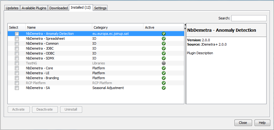
A list of installed plugins
Options
The Options window includes five main panels: Demetra, General, Keymap, Appearance and Miscellaneous. They are visible in the very top of the Options window.
The main sections of the Options window
By default, the Demetra tab is shown. It is divided into seven panels: Behaviour, Demetra UI, Statistics, Data transfer, Demetra Paths, ProcDocumentItems, and Interchange.
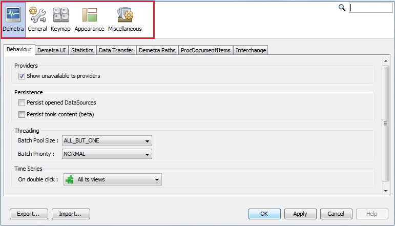
Behaviour defines the default reaction of JDemetra+ to some of the actions performed by the user.
-
Providers – an option to show only the data providers that are currently available.
-
Persistence – an option to restore the data sources after re-starting the application so that there is no need to fetch them again (Persist opened DataSources) and an option to restore all the content of the chart and grid tools (Persist tools content).
-
Threading – defines how resources are allocated to the computation (Batch Pool Size controls the number of cores used in parallel computation and Batch Priority defines the priority of computation over other processes). Changing these values might improve computation speed but also reduce user interface responsiveness.
-
Time Series – determines the default behaviour of the program when the user double clicks on the data. It may be useful to plot the data, visualise it on a grid, or to perform any pre-specified action, e.g. execute a seasonal adjustment procedure.
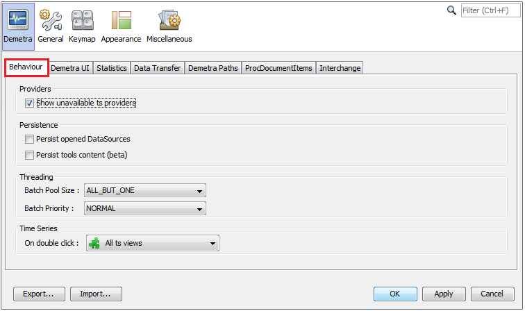
The content of the Behavior tab
The Demetra UI tab enables the setting of:
-
A default colour scheme for the graphs (Color scheme).
-
The data format (uses MS Excel conventions). For example, ###,###.#### implies the numbers in the tables and the y-axis of the graphs will be rounded up to four decimals after the decimal point (Data format).
-
The default number of last years of the time series displayed in charts representing growth rates (Growth rates).
-
The control of the view of the window for adding pre-specified outliers. (Pre-specified Outliers).
-
The visibility of the icons in the context menus (Context Menus).
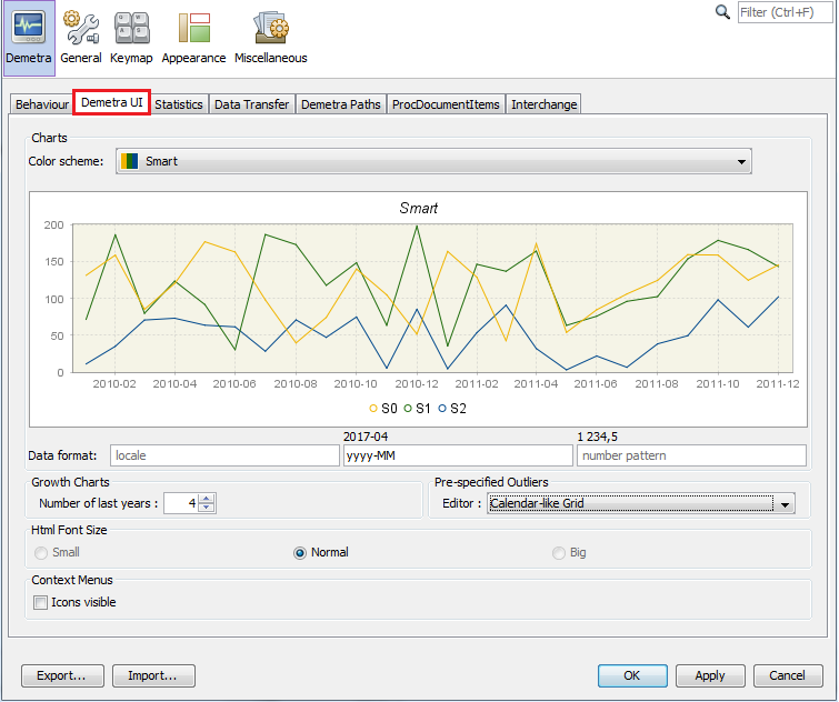
The content of the Demetra UI tab
The Statistics tab includes options to control:
-
The number of years used for spectral analysis and for model stability (Default Number of Last Years);
-
The default pre-defined specification for seasonal adjustment (Seasonal Adjustment);
-
The type of the analysis of revision history (Revision History):
-
FreeParameters – the RegARIMA model parameters and regression coefficients of the RegARIMA model will be re-estimated each time the end point of the data is changed. This argument is ignored if no RegARIMA model is fit to the series.
-
Complete – the whole RegARIMA model together with regressors will be re-identified and re-estimated each time the end point of the data is changed. This argument is ignored if no RegARIMA model is fitted to the series.
-
None – the ARIMA parameters and regression coefficients of the RegARIMA model will be fixed throughout the analysis at the values estimated from the entire series (or model span).
-
-
The settings for the quality measures and tests used in a diagnostic procedure:
- Default components – a list of series and diagnostics that are displayed in the SAProcessing \(\rightarrow\) Output window. The list of default items can be modified with the respective Select button (see figure below)
- Diagnostics – a list of diagnostics tests, where the user can modify the default settings (see figure “The panel for modification of the settings for the tests in the Basic checks section” below).
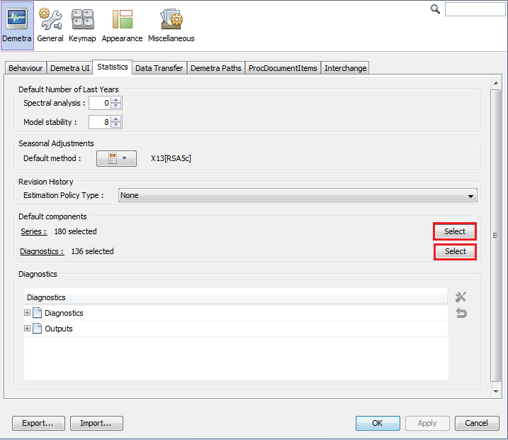
The Default components section on the Statistics tab
An explanation of the list of the series and diagnostics components that are displayed in the Default components section can be found here.
To modify the settings for a particular measure, double click on a selected row (select the test’s name from the list and click on the working tools button), introduce changes in the pop-up window and click the OK button.
To reset the default settings for a given test, select this test from the list and click on the backspace button situated below the working tools button. The description of the parameters for each quality measure and test used in a diagnostic procedure can be found in the output from modelling and the output from seasonal adjustement nodes.
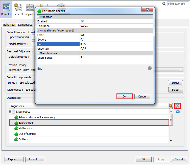
The panel for modification of the settings for the tests in the Basic checks section
The users can customize the diagnostics and they can specify the default settings for different outputs. Their preferences are saved between different sessions of JDemetra+. This new feature is accessible in the Statistics tab of the Options panel.
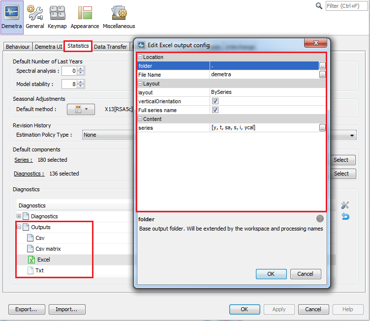
The settings of the output files
The Data Transfer tab contains multiple options that define the behaviour of the drag and drop and copy-paste actions. To change the default settings, double click on the selected item. Once the modifications are introduced, confirm them with the OK button.
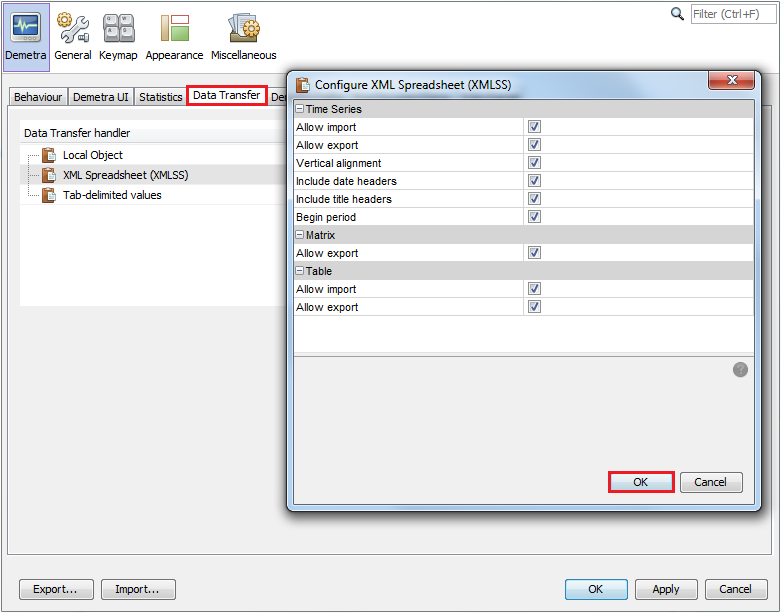
The content of the Data Transfer tab
Demetra Paths allows the user to specify the relative location of the folders where the data can be found. In this way, the application can access data from different computers. Otherwise, the user would need to have access to the exact path where the data is located. To add a location, select the data provider, click the “+” button and specify the location.
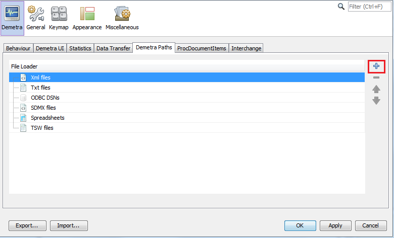
The content of the Demetra Paths tab
ProcDocumentItems includes a list of all reports available for processed documents like seasonal adjustment. The Interchange tab lists the protocols that can be used to export/import information like calendars, specifications, etc. For the time being, the user cannot customize the way the standard exchanges are done. However, such features could be implemented in plug-ins.
The next section, General, allows for the customisation of the proxy settings. A proxy is an intermediate server that allows an application to access the Internet. It is typically used inside a corporate network where Internet access is restricted. In JDemetra+, the proxy is used to get time series from remote servers like .Stat.
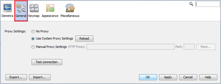
The General tab
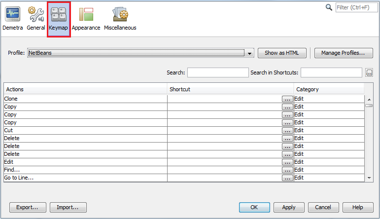
Keymap provides a list of default key shortcuts to access some of the functionalities and it allows the user to edit them and to define additional shortcuts.
The Keymap tab
The Appearance and Miscellaneous tabs are tabs automatically provided by the Netbeans platform. They are not used by JDemetra+.